The diminishment and demise of newspapers has all but killed the photo essay, and the role of its design in storytelling.
Getting the annual guide to the Best in Newspaper Design used to be a red-letter day at the office.
Once the editor digested its content to glean potential ideas, the rest of us would secret it to our desks to bask in the glow of creative page designs and photo layouts put together by some of the best newspaper graphic designers in the world.
We were inspired by their use of fonts, colour and graphic elements to complement and support the stories being told by the journalists in words or photos.
We marvelled at the way photos were chosen and displayed together to lead us through the story, take us to its very heart.
Reading a newspaper is like taking a journey; each page promises a new destination that can ignite our imagination or just fuel us up to get us to the next page.
A well-designed and thoughtfully-constructed destination page, like section fronts or double-trucks inside, invite the reader to linger, invest the time to read the story then move on to further pages to see what other goodies might be in store.
When I broke into the business in the mid-1980s, USA Today was regarded as the pinnacle of newspaper design.
Editors loved its multitude of stories launching off the front page, giving readers several entry points into the rest of the paper.
Its liberal use of boxes, colour washes, graphics, bullet points and explainers made it feel vibrant, fun and accessible.
Of course limited resources at the lower end of the newspaper industry meant our efforts to emulate the USA Today look were usually half-baked — it was the thought that counted.
Laying out a photo page or section front was one of the many things I missed when it was decided the Tri-City News should go digital-only.
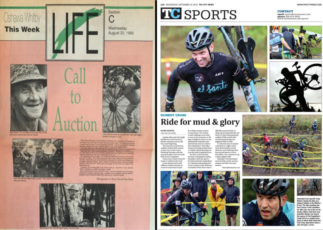
When I was shooting a story with good photo possibilities, I did so with an eye to pitching it to the editor to run as a spread; that meant I needed a variety of photos to help drive the narrative — wide-angle establishing shots to set the scene, tight detail shots, close-ups, reactions, maybe a silhouette, and a strong vertical or two to help with the layout.
Editing a take of 15 or 20 photos down to five or six that best captured the essence of the story could be an anguishing process, as was deciding which photo to run largest, and whether to put captions under each individual photo or grouped together.
Sometimes those decisions meant a favourite photo, or one that took a lot of work or forethought to get, wouldn’t make the cut.

If a photo didn’t serve the story, or work with the other photos, maybe it wasn’t that great to begin with.
But, just as newspaper executives deemed photojournalists expendable once they realized everyone with a smartphone could shoot a photo of a car accident, house fire, or ribbon cutting, page designers also became an expensive luxury. Templated designs and centralized production protect profits.
Digital-first then digital-only further sap the creative presentation of news. Content management systems for web upload demand uniformity.
For the most part, online photo galleries favour quantity over quality. Their design is linear, with readers clicking through from one photo to the next until their fingers wear out or their interest wanes; their only narrative usually doesn’t get beyond “the photographer showed up.”
Some publications have made an effort to transfer the design of storytelling to the digital realm.
The New York Times and Washington Post do interesting things on their websites from time-to-time, and I’m sure there are others with the staffing, expertise and resources.
A decade ago, the Toronto Star invested heavily in its Star Touch app for tablets. Its early iterations had some wonderfully ingenious and playful presentations that took advantage of the technology to help drive stories — like an explanation of a lunar eclipse set against an image of a full moon that slowly went into eclipse as you scrolled through the text.
I loved it so much, I stayed up until 11 p.m. PST every night so I could read the next day’s edition on my iPad when it dropped at 2 a.m. EST.
“This is the future for our industry,” I thought.
But the cost for such innovation proved too high.
Within months of Star Touch‘s launch the clever animations started to dwindle as staff and contractors were cut. Soon it became little more than just another website, and within two years of its genesis, it was gone.
